Category Archives: #radioshowpromo

Radio Show Logo

Radio Show Design Assignment for Week 9

This is a logo I designed for the radio show group project based on the Apple Weather App logo. Our radio show is news based and will have a focus on weather. I used the art program Krita to draw it, using many built in tools to achieve what I wanted. I used a watercolor brush to make the background (my original idea was to make stormy clouds) but then I darkened it with a filter and added the cloud and sun with the neon effect to incorporate tech into the logo. A friend of mine helped me to create the neon effect and I ended up using six layers total on neon alone.

Crimes & Roses Poster

While brainstorming ideas for our podcast theme, Rylie suggested a more scrapbook/collage look. I took the idea and put my own spin on it, going to Canva looking for an old newspaper graphic for the background. I found a graphic that fit the idea, and I adjusted its transparency and lighting to be more subtle. I then browsed through the Spotify crime podcast genre to gain some inspiration. I noticed many of the titles in the genre to be very bold and easily visible, so I took a bright yellow empty caution tape graphic (which fits the crime theme) and put our title in it. To finish things off, I found a scrapbooked rose graphic and added some elements to it like the blood dripping off the petals to give a more eerie vibe. The poster is something that is not too busy but easily captures the elements of vintage and crime.

Poster

Here is a poster I created for the sho, this can be used to advertise and promote the show. It is a simple black and white contrast spilt down the middle to play into the title of the show “The Opposites”. I also added black and white radio waves to also go with the black and white theme it also takes insperation from the yin yang symbol which also is a symbol for opposites. Lastly i added a little “On Air” neon sign in the bottom corner opposite from where i placed the title, this sign is just a simple detail that is something you would see in a recording studio

Post This Flyer

For my design project for the radio show I decided I wanted to do a collage type of poster.

After brainstorming with my groupmates we decided with this newspaper, scrapbooking look. And I thought this was a great opportunity to use pinterest collaging. I started with a newspaper and added flowers to it on pinterest. I then moved into procreate and found sketches of a broken clock and a dagger. I edited them and added them into the collage. I then added the text of our radio show name and made sure it was legible against the text of the newspaper.

Turns Out, Listening to Podcasts Doesn’t Mean Making Cover Art Will Be Easy

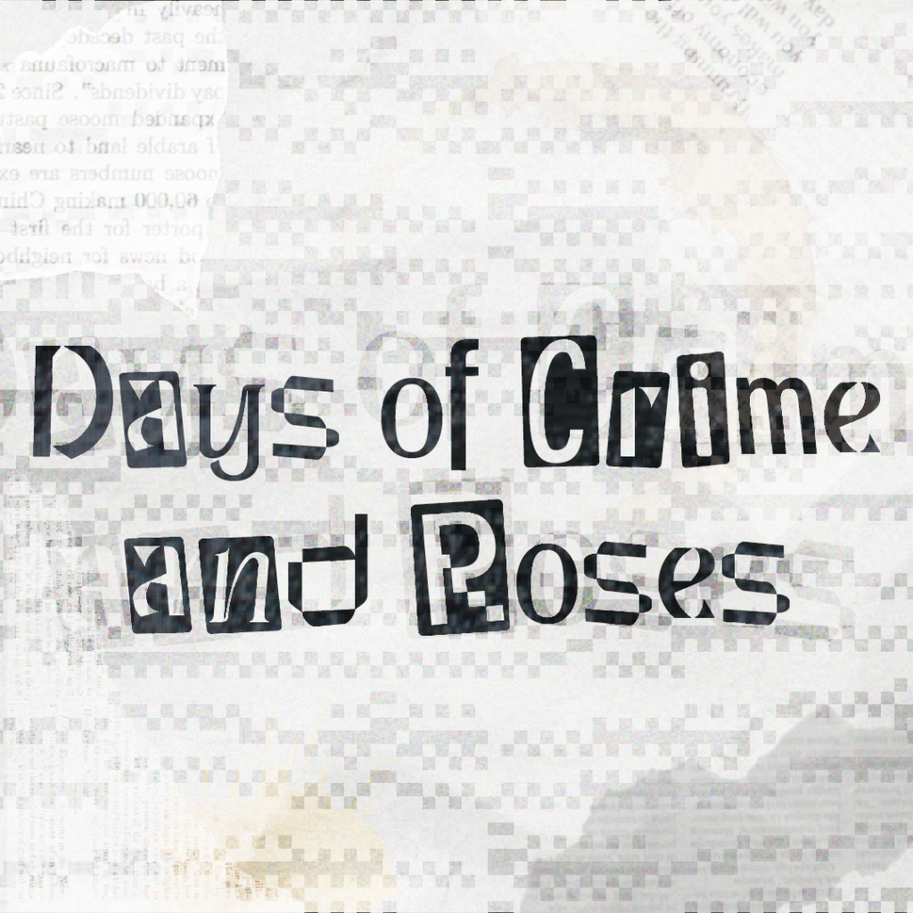
For my little bit of design work this week, I created a logo/cover art for our radio show, Days of Crime and Roses. I used Adobe Illustrator for this, and sourced my font off of 1001 Fonts, which isn’t a font site that I’ve used before but I liked the variety! Once I found one that I liked, I ported it in to Illustrator and began working. My base was a paper texture that I duplicated and changed the blending mode on. After that, I continued adding both tech elements like the glitch effect and pixels as well as physical elements like the newspapers and coffee stains. I think this design would work well as a cover image or social media icon, and I think the font is strong enough to act as a general logo! I didn’t want to go for anything too literal, which did make getting started a bit difficult.

Don’t Miss This Futuristic Trivia Show!

If you think you got what it takes to win then be sure to listen in on Noir Games and see how many answers you know! Two teams go head to head for a prize of 1 million dollars in this wild high-tech game of ultimate trivia!

For my promo poster for Noir Games I used Canva to design it. Since it is supposed to be a futuristic game show I used all neon design options including the texts and the small details like stars, smiles, lightning, and the trophy between the title on top. I wanted to include a slogan for it so I wrote, “Trivia just got an upgrade,” to make it sound more exciting. Also to make it seem more like a realistic promo poster I also added, “New episodes every Friday,” as if it is a real radio show. Lastly, the background is more straightforward with the use of a game show image which instantly explains what the show is about to the audience. I also used Canva to make the trivia example picture above to show the type of questions the participants will be getting.

Promo!

M. Marshall 3.21

So my group has discussed a couple of different ideas for our radio show, what we landed on was having one in the style of a news report. I figured that promoting my character’s part of the show made the most sense, so that’s what I started with. Like I’ve said in past posts, my character is a cyborg cat. I want my portion of the show to be about how she was turned part robot, so I used AI to create an image. I know using AI is not great for the environment, but I wanted it to look a certain way that I knew I could not illustrate. I went to Canva to start and I discovered their AI image generation tool, so I used that! I would have liked to put “tune in on” this date or this day of the week, but I opted not to just to prevent inaccuracy. The prompt I gave the robot was “I would like an image of a cyborg cat (part robot, part cat), basing the cat off of the cat in the image” with a photo of my cat, Daisy, which I will of course show.

The resemblance is remarkable, honestly!

I added text over and had it be outlined because it was somewhat difficult to read without.

So, yeah! Tune in to find out!

Radio Show Design Project

For my part of the radio show, this poster perfectly captures my character, Jack Cross, while tying into our overall theme of news reporters in different local areas.Jack isn’t a typical journalist he barely speaks, but his actions say it all. By day, he’s a skilled mechanic; by night, a getaway driver helping people escape danger. His ability to stay calm under pressure makes him the perfect reporter for high-stakes stories.

The poster blends his mysterious nature with a newsroom theme. The dark cityscape, sleek car, and microphone highlight his role, while the tagline, “Breaking News: Jack Cross Delivers the Truth, No Matter the Cost,” reinforces his no-nonsense approach.

This design reflects both Jack’s character and the suspenseful, action-packed tone of our radio show. Stay tuned this is one broadcast you won’t want to miss!

Radio Show Promo

logo with five pink female silhouettes, with radio waves in the back, and then the name "Fearless Femmes" "Cyber 75 The Vibe"

Here is a logo for my group’s radio show! I made it on Canva, as well as found this single silhouette of a women. I knew I wanted to represent each group member somehow, so I duplicated the silhouette, and made them pink to represent the “Femme”. I wanted to keep the cyber-vibe, so I made the colors very neon and bright. I also added radio waves in the background in order to emphasize that this is a radio show. I had a lot of fun with this, as I did struggle at the start to come up with ideas, but I am happy with the final product.