It’s been a while since I contributed to the Walk of Life Project, and an even longer while since I watched To Live and Die in LA, so why not kill two birds with one mashup? As far as Walk of Life endings go, this one doesn’t do much other than add to the list. Mostly I just wanted to get a picture of adding a second soundtrack in iMovie:
What I did here was import my video file and my MP3 soundtrack, then overlap and align them in the editing window. I split the video with Cmd-B where I wanted to second soundtrack to take over, and dropped the video volume to zero after that point. I split the added audio at the same point and reduced the volume a little before it.
This week I did two daily creates. The first one that I did was a random animal generator. I got a camel cricket. The next daily create I did was a secret agent name generator. I got Agent Rouge Hawk. I then used AI and plugged this name in and asked it to create an image based off this name.
Lastly, my group from the last project decided to work together for the final. We had a zoom call on Thursday to figure out exactly what we wanted to do and even started talking about the process for the final too. We created a trailer based off our course characters. We each uploaded things like images, audio, and videos into a shared google drive so that we all have access to it. It was all edited together to make the trailer and then uploaded to youtube.
This week was calm and fun. My group got started with the trailer really early in the week which took a lot of the stress off the trailer. Our trailer turned out great! Martina did great with the editing. The Fearless Femmes had a really fun time creating the trailer and I’m so excited to see what our final project. To see more of our process you can check it out here.
This weeks creates were much more exciting than previous week I Feel like they actually called for more creativity than recent weeks. I completed three this week and these might be the last, but we’ll see. Here are my daily creates for the week:
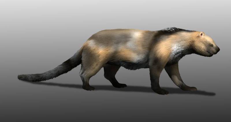
This is my new pet Sarkastodon. He is sort of like a prehistoric hyena. His name literally translates to “flesh-tearing tooth”. He will eat any large animal (or human) and needs 200+ pounds of raw meat per day. He is my personal bodyguard.
4/11: National Pet Day
For national pet day, my dog Max (the chocolate lab) is hanging out with his long-distance girlfriend Lola (my sister’s dog) today and is seen here snooping around her cage. Lola only comes over on special occasions, so Max is actually really excited despite the glum look on his face which I believe he is giving me for interrupting his private time with Lola.
I absolutely loved filming the trailer for the final project. The Fearless Femmes decided to get together again and make the final project and trailer. We all loved working together on the radio show and decided to work together again.
First we met on Wednesday the week before the project was due and brainstormed ideas. It was a bit difficult to settle on an idea for a while but then we settled on “The Real Housewives” concept we were all really excited and fans of the show and started throwing out ideas that could relate to cyber and tech noir.
We met Monday to film the trailer, we filmed in the green screen room in the HCC. It was really fun and creative. We had a fun time and just bounced ideas off each other. The only problem we ran into was getting the camera to focus, but we figured out pretty soon.
Here is he finished project, we’re still brainstorming the actual show but i’m very excited to see the outcome.
Girl, this week has been too much. I had an event reschedule, ended up with three group projects, was double booked whenever I had things to do, and had people have to bail on meeting up with me. If you’re interested in listening to Mozart’s Requiem, I’m singing the entire thing on Sunday. I need to make my therapy appointments more frequent. Anyway, as per usual, I did three daily creates:
We had a zoom meeting to discuss our ideas for the project, and I decided to edit everything together with a (unknown to me at the time) double booked schedule. I don’t know why I did this, but we have a solid head start for the final project. My group members and I found stock images, video, music, sound effects, and took some pictures ourselves. We put everything together in a google drive folder and I edited it in OpenShot Video Editor. I put all the files together at specific times, making some images last longer or shorter, making sure everything fits in with the music, and trimming some audio and video to make everything fit. We wanted the trailer to be like an introduction to our characters, which would be expanded upon in the final project. To be honest I probably should’ve used Krita and CapCut and OpenShot Video Editor, but hey, we’ve got two weeks to work on that. We plan on writing out a script for the final project in our next zoom meeting. I very much appreciate that my group members found or made files for their characters/stories and sent them to me, because that would’ve been a bit of a nightmare to figure out. Thank you to listening to my ramblings, I’ll see you next week.
This week has also been on the lighter side, similar to last week, which I’ve been thankful for. Unlike last week, the final project is now impending, so my group for the radio show (Emily H., Sam H., Brigid W.) decided to work together again for the final project! We had a Zoom meeting to discuss ideas, and Emily edited together a very beautiful trailer using footage/pictures from all 4 of us, which you can read about here. Or just go straight to the page on YouTube.
I also did 3 daily creates, here they are:
National Pets Day
Secret Agent Story
How long could I make it in the wild with the proper tools?
How long could you survive without a ds106 post? Not long! Cause its #4life.
This week was more of a chill week in a sense where there was only 2 assignments, like most weeks we started off with Daily Create Week 12 these are always fun for me since there are so random. My favorite one was national pet day because who does not love their pets! We then started as a group tackling the trailer project. We first met on zoom to talk about what we wanted to do and how we wanted to do it. trailer this was a fun project and helped out learn more about each others strengths are weakness for the upcoming final project we will be working on together. I do think this turned out pretty well! I think we could use some voice overs though for the final project. I do think we did well on creating a mood in this trailer, when seeing it for the first time I felt a tad bit tense because of the music and cinematic shots. For the final though we should defiantly work on trying to get betting stock images to really make it seem like a movie trailer. Overall this was a very fun week!
Finally this week was a creative week of daily creates. For the past couple of weeks they were pretty simple and niche, but this week they actually called for some creativity. I completed three creates this week.
The first create was Monday, The prompt was to generate a random animal. The animal I got was a giant panda. I don’t know a lot about them so I looked up a couple interesting facts and included them on my daily create post. Check it out here:
The next create I completed on Wednesday was my favorite of this week. The prompt was to make a poem ot of a sentence that you overheard that day. I overheard my sister talking about job seeking and she said “why do I keep seeing this job” so that’s what I made the poem about. It was pretty difficult but I didn’t want to spend to long on it. You can check it out here:
The Final Crate I finished was Friday. It’s National Dog day so I included a picture of my dog teddy going on his daily walks that he loves. You can check it out here:
I believe this was the last week of required daily creates. I really enjoyed doing these, sometimes it was annoying to remember, but I really appreciate how it helped with my creativity and thinking outside the box.