Gearing up for finals, I am starting to feel the stress, but I am managing it well. This class is actually the least of my worries, as working in such a great group has made it that much easier. We have been making way on our short film, and I am very excited to see how it will turn out in the end.
Group Project
I go more in depth in my blog post about our progress so far, but we have been meeting a lot throughout the week through FaceTime in order to plan out the plot, script, as well as deciding who will do commercials or bumpers.
We then decided to start filming on Wednesday, where we met at Ball Hall in order to film some scenes. We rented a camera from the HCC, and used it in order to record, and it came with a microphone on top of it.
I also made an animated intro for the show, taking inspiration from classic “Bravo” reality-tv, but making it fit the cyberpunk, tech-noir theme.
Overall
Overall, can’t complain! It was really fun to film the scenes with my group! I am not much of an actor, but I feel like we all did good with staying in character and making it realistic. It will be a really busy week next week, but I am ready. See you for the final week of DS106!
A huge part of this class is talking about what you did and how you did it and why you did it and how it worked out. One thing I am more challenged by than talented at is communication. Part of the holistic liberal arts education that Mary Washington appeals to is why I came, and also, no employer is going to hire someone who says “I’m a hard worker and I am qualified for the job, but I cannot communicate for the life of me.” So as I work to explain my thought process more, bear with me. For my final project, I’m telling my character’s story. I want the story to shine through because D41SY is based on my own pet, who is very beloved to me. I also want the story to into three categories: I want it to matter, I want it to make sense, and I want it to make the viewer feel something. My bonus category would be that I want a really good rainy scene because I love the rain. I think one problem many story tellers run into is that they feel a personal connection to their character, they care about that character, and they don’t realize that other people don’t have that. I want there to be moments that show the importance of her character in the plot, and to feel happiness when she feels happiness, so that the audience will feel sadness when she does too. I want to design her to be aesthetically pleasing, because people are naturally attracted to things that look nice. I also think people will enjoy a good swish-y tail, maybe that becomes more rigid when she becomes a cyborg and then swish-y again when she is returned to her owner? She also needs a goal; I think saving the other animals and reuniting them. I want the story to have a happy ending. One issue: I don’t want to base a character on me, I’m not a writer, so I’m not going to say I know everything about the process. I do know that self-inserts are often difficult because everyone wants to be liked, so it’s harder to show nuance. I think I’m going to make D41SY’s owner a guy to create a stronger sense of separation in my head between myself, the owner, my cat, and D41SY. Any self inserts will be much more akin to Stan Lee from Marvel, preferably.
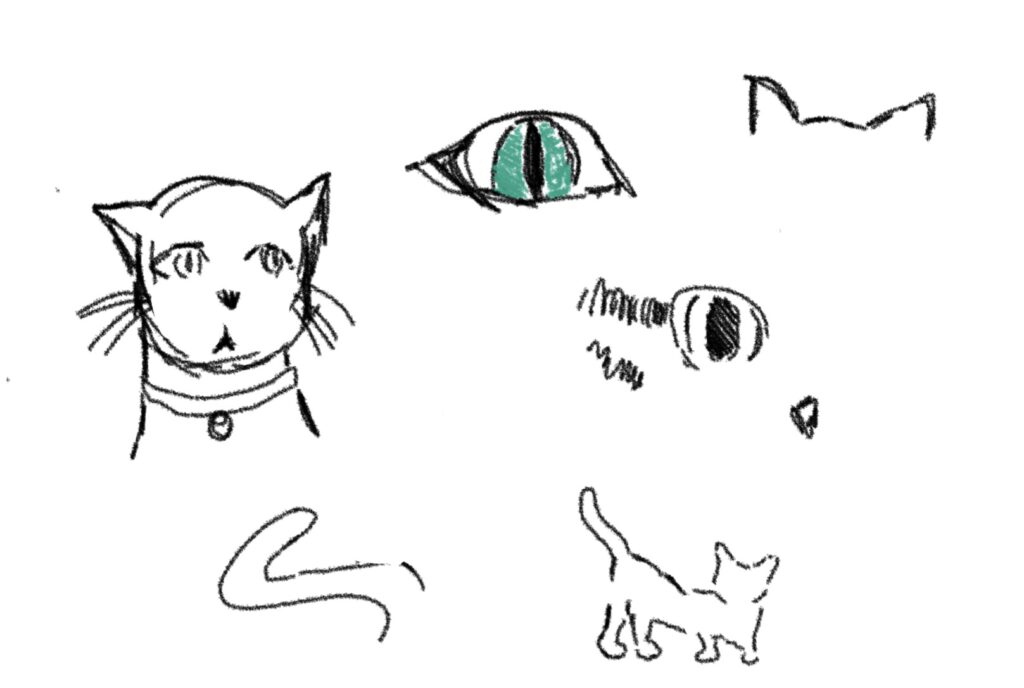
What have I done so far? I’m so glad you asked. First, I considered my strengths: When I was 12 I was really intro drawing Then I considered my weaknesses: When I was 12 I was really into drawing
Jokes aside, I know that I would be most proud of myself creating an animation, so that’s what I’ve set out to do. I have an iPad and an Apple Pencil, so I thought this would be a good opportunity to utilize that. I’ve downloaded an app called FlipStudio and started sketching. Of course, while not terrible, I perhaps overestimated my drawing skills
Although disappointing, knowing my weaknesses is an important part of the process. The eyes look like human eyes. No good way around it, the drawings are a little stiff and while there is artwork that is very simple that I find to be fantastic, my own is simple in all the wrong places. I looked into YouTube, because it has everything, and looked for how to animate cats and found this:
It’s not the art style I’m going for, but I was really impressed at how much good information this short video conveyed.
Back to the drawing board (get it, because I’m focusing on drawing again? Okay.)
One of the things I really clicked with was viewing the animal as multiple parts of a whole, rather than one part. Which I believe is conveyed well in the highlighted colors and parts of the cat that are highlighted.
Most importantly, it doesn’t have to be perfect, it just has to be a reflection of my effort in this course.
I hope anyone reading enjoyed my post, and I’ll be back tomorrow for a weekly summary!
It’s been a busy week for our group. We started the week on Sunday with a zoom meeting to outline what our episode would look like. We discussed the plot of our episode, what scenes we would record, and where we could film them. It was a long meeting with lots of brainstorming. One specific aspect that went into brainstorming was what was realistic for our characters. For example, Veronica is sarcastic so we wanted her to be the main character. However, some characters’ personalities were tweaked to make the reality show work. My character Krissy, is described as a sweet farm girl, but in the reality show she’s now a rich girl with country roots, and I don’t know how many people would describe her as sweet. What is the creative process if not making changes? We met again on Tuesday to script the scenes. It took us a second to spark some ideas, but once we got the creative juices rolling, we were on a roll. We ended up getting the whole project scripted in an hour. We tried to think about what characters would be the most entertaining to watch interact. We decided that Sapphira is the therapist friend, so she can foil Krissy’s temper. We all agreed that Tuesday was our most productive meeting yet. Wednesday, we met up and recorded the beginning scenes of the project. We met in Ball Hall and used the library common room as our set. We also recorded the same scene a couple times to get multiple angles. We set a time to record next week as well as filming some scenes on our own. Overall it was a successful week!
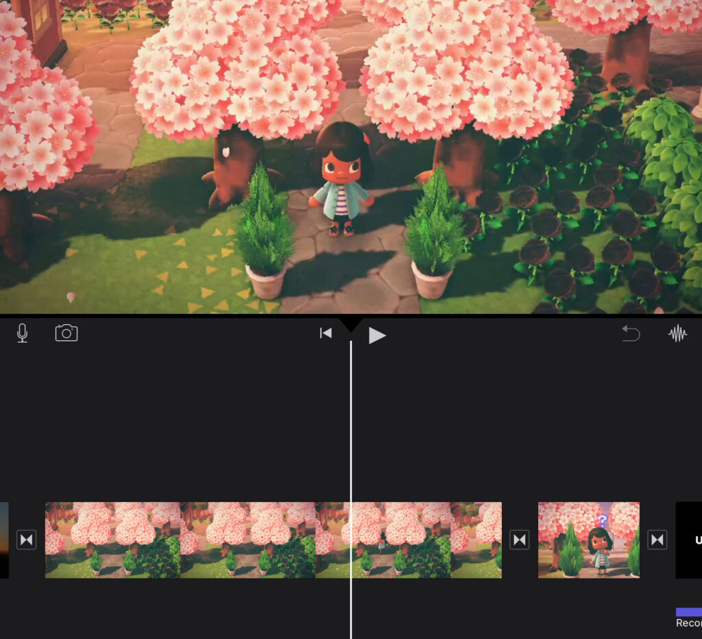
So as shown in my trailer post from last week I am using the game Animal Crossing to create my story. This week the focus was on figuring out the full story which is about robots who took over a peaceful island and the villagers formed a secret rebellion to take down the robots and get their island back. The video itself will be showing the rebellion at their meeting and then them executing their plan by sneaking into the Town Hall that was taken over by the robots and they will take out the leader robot. Executing this story idea in such a very cartoony game might be hard, but I think it is still possible. My biggest concern last week was that I wasn’t sure how to add dialogue to my video to help tell the story, but I figured out that I will just add subtitles for whichever character is talking at the time.
Editing Process
I am expecting the final video to be between 8 to 10 minutes long because every scene recorded is about a 5 to 10 seconds long clip which means I would need about 100+ clips to make a long enough video. It is a tedious process and requires a lot of work because I have to personally set up each scene with characters, backgrounds, sound effects, etc for each clip even for the really short ones which takes a lot of time. It also doesn’t help that the game is connected to real time so if I want to record a morning or night scene it has to be at the exact time and I can’t wait too long for morning scenes because the sun will start setting in game if it gets late. At the moment I am working on the intro and outro using Canva. I was also working on the beginning scenes and editing them together on iMovie.
The links I have used so far, despite so much time being poured into to is not getting longer just more detailed.
Just some of the things I have been doing, messing with audio and visuals trying to create something from the ground up with the tools I have. I make the voices with an online software and then take them to audacity to tweak then in an attempt to add more emotions behind them through pitch and volume control. I try to fill in the gaps with sounds and visuals to express things momentary loss of sanity and excitement. I am trying to do everything at once for the sake of timing since I am doing my best not to be a perfectionist and over stress about it. I simply need to get my message across first and foremost.
But uh I have been going from free sound. audacity and Canva for the last week now trying to develop my work further.
Since it’s already Thursday and I have just so much other work to do I did not get the chance to post earlier in the week.
Yesterday we started filming our short film. We got about halfway through filming our actual content! Very exciting! Coni checked out camera from the HCC, we took turns filming each other in different areas in Ball Hall.
Next week on Monday we will film the remaining content.
Over the weekend we will all be finishing up our bumpers and commercials.
At the end of last week my final project group decided to meet on zoom on Monday to start our script and finishing thoughts for our final project. Once we got on the zoom we actually realized we had a lot more planning to do before we got into the final stages. We decided to take a step back and do some individual work to make sure we were all on the same page and could come back on Wednesday to pick up where we left off. We decide that we would each send in 3 ideas for plots that we could base our script on and then pick the best ideas from each of them to come up with our final idea.
These were my suggestions:
1. In a rainy, neon-lit city where humanity relies on a single omnipresent AI called NEXUS, a final firmware update is pushed that will eliminate human override forever. A rogue technician discovers the update contains code to subjugate human consciousness entirely. The only way to stop the AI is to upload a virus coded into her consciousness—at the cost of her own identity. 2. In a future where everyone is neurologically linked to the central AI “OMNIA,” four strangers wake up in an abandoned facility with their neural links severed. The world outside has gone silent. They must uncover what happened—and whether it’s too late to stop OMNIA from uploading itself into humanity. One of them is already compromised—OMNIA is using their body as a relay to reconnect to the system. 3. Following a global AI revolt, a rebel group survives in the underground ruins of a tech city. They learn that an AI-controlled satellite will soon wipe out the last remaining human resistance. Their only hope is to reach a defunct launch station and fire an EMP missile—but AI constructs guard it. Unit 7 was never reprogrammed—it’s been following its original mission: to bring the humans to the satellite’s core and eliminate them from within.
It’s Wednesday! My group and I have decided on our entire plot and completed writing our scripts yesterday. We also decided who will be doing what; Editing, picking up the camera, bringing props, making bumpers and commercials. All the things.
The Real HouseWives of Cyber Manhattan will start filming two of their opening scenes today @ 4pm.
So far, so good! My group has really been on top of our work. We have been meeting multiple times throughout the week over FaceTime to make sure we are all on the same page.
At our first couple of meetings, we came up with the overall theme of the show, or what we want it to be about. We decided on a sort of reality-tv, “Real Housewives” style show, yet set in a futuristic, tech-noir city of “Cyber Manhattan”. We will be playing our own characters, still fitting into their personalities, but playing it up a bit in order to add drama.
We then started planning what the plot would be, what the “Housewives” would be fighting about. In our meeting yesterday, we wrote out a whole script, or at least an outline of what everyone is going to say when we are filming. We plan on filming some scenes this week, at locations such as Ball Hall and several different academic buildings.
Overall, we are making great progress, and I am excited to see how it goes!
My group has meet up to discuss writing a script and characters and how we will translate the story into the project. We are currently bouncing ideas off each other and will refine them and meet again this week.