Radio Show Experience!
It was so fun being able to see my own creation play live on a radio and it is definitely an experience that I will never forget! I put a lot of effort into Noir Games so I enjoyed reading everyone’s comments and compliments on Discord. I’m happy that everyone appreciated the sarcastic lines of the characters so much, especially the ones written for Dr. Oblivion because those were my favorite too. I am assuming this is how producers feel when they finally get to reveal their shows, movies, etc after weeks of work. I was not able to talk live on the radio due to complications with a noisy background because of my family, but I was able to still answer various questions through Discord text on the process of creating the radio show and the thought process behind the choices my group and I made for it which was nice to experience. If anything, after listening to Noir Games play on the radio I wish more background music was edited in to make it sound more like a game show. Also maybe more sounds of an audience reacting in the crowd to make it sound more realistic.
Spotlight: Fearless Femmes!
I was also able to experience listening in on the other radio shows presented but the one I want to put a spotlight on is Fearless Femmes! I enjoyed listening to their show a lot! It sounded like a realistic gossip talk show and there was a lot of funny moments like the story about the person who found out their boyfriend was a robot. I think it was a good idea that they used their actual voices to record instead of ai because it made it feel more personal and relatable when they would share their stories. Also the use of the telephone ringing every time there was a new caller was a good transition sound for telling the audience a new person’s story was about to be introduced each time. I also don’t want to forget mentioning their intro, commercials and radio bumpers which also sounded pretty realistic and very detailed. Overall, this group put a lot of work into their radio show and if it was real I probably wouldn’t mind tuning in to listen to more funny episodes!


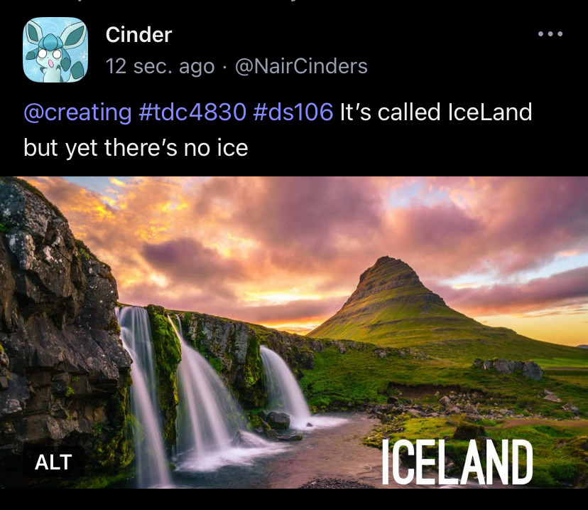
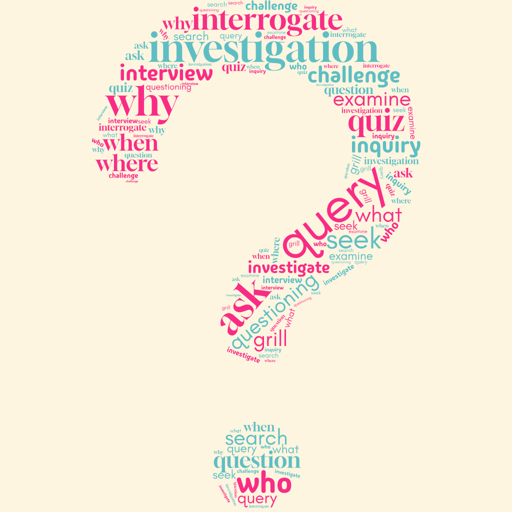
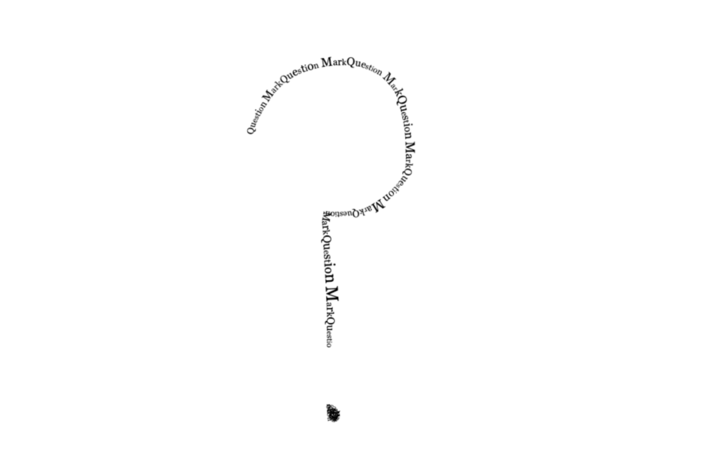
 ” The gif looked really good, and I was really impressed with Liv’s skill. Next, I commented on Cinder’s unreadable text DC, theirs was my favorite from the week. They found an illustration that looked like men in a pool and said it was the first pool party, which was very creative. The thing that makes me laugh, is that the men are naked and the water is green. I commented, “Hahaha I love this idea and the added speech bubbles make it even funnier. But there’s one aspect that I can’t overlook… if that’s a pool, why is the water green? What are they doing in there?” I am very curious to know if that crossed Cinder’s mind when they made that Daily Create. The last think I commented on was Ryee’s question mark daily create. They used Procreate and played around with the the different brushes to create a question mark. I commented, “I like the chaoticness of this brush! I love Procreate, it’s so much fun to doodle on!” Last I checked, procreate is only available on the apple store, which stinks because I don’t have an iPad and I would love to have the app on my laptop.