“Use the Secret Agent Name Generator to create your own, and then write a little story or generate some artwork about the life or a mission of your secret agent (which, eh, is you!).”


“Use the Secret Agent Name Generator to create your own, and then write a little story or generate some artwork about the life or a mission of your secret agent (which, eh, is you!).”
Prompt: Your Secret Agent Name
Introducing Secret Agent Indigo Flame!

Prompt: Survival Skills
I don’t think id do well. Id panic for sure. When playing minecraft in survival mode, my survival tactic is simply to make a hole and only come back out when its day time and even then I die so fast. Im actually so bad at this game…

“The random animal generator uses a curated collection of high-quality wildlife photographs to help you discover fascinating creatures from around the world.”

This week was pretty low stress which was nice after finishing up podcasts. I really enjoyed listening to everyone’s podcasts and seeing how creative everyone was with their ideas. I also really enjoyed the process of creating the podcast with the Fearless Femmes. It was my first podcast and I think it came out great. Listening to everyone else’s podcast inspired new ideas for me in terms of bumpers and commercial ideas. To see my full in detail reaction t this weeks podcasts you can click here:
I participated in 3 daily creates this week. These may even be the last three of the semester but, we’ll see how hectic the week is with getting ready for the final project and trailers. To see the daily creates I completed this week you can click here:
I have already started planning for my final project and Trailer Due next week. As I mentioned previously I really enjoyed working ithb the Fearless Femmes. We work really well togeher so we decided to team up together again for the final.
We have some really exciting ideas for the show! We met Wednesday to go over ideas and brainstorm. We came up with Final Project idea and agreed to film our trailer for the project Monday.
I really enjoyed everyones podcasts and daily creates this week. I can’t wait to see how creative everyone gets with their final projects and trailers! See you next week.
sincerely, Kristen
We had a lighter week this week and got to listen to some radio shows. I was only able to listen on Wednesday because of night classes, and I actually skipped part of a club meeting for it, but I enjoyed getting to talk about the process. I completed my Radio Show Review about The Opposites Show today, though I had been working on it since Wednesday. I also completed three daily creates this week.
Daily create 4827, daily create 4829, daily create 4830


See you next post!
4/1
Here is a timelapse of me learning how to use Blendr for today’s Daily Create
3/28 Creative limits
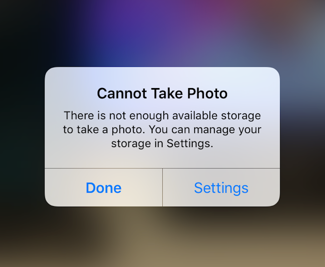
Running out of Photo storage space can be seen as a metaphor for life’s limits. It forces you to decide which memories to keep and which to let go, turning a digital limit into a creative call for more mindful curation.
4/4 Ironically Named

This week was pretty light. The group that I worked on the radio show with decided to work together for the final. We started brainstorming some ideas but are still very much in the early stages of our product.
I was unable to join the radio show this week to hear the rest of the classes shows because I had games this week that prevented me from being available. My group mates joined and told me that they heard a lot of good things.
Lastly, were my daily creates. The first one I did was for April Fools day. My team lifts at 6am and the upperclassmen decided to show up late and in a different uniform than all the freshman. They started calling us and checking our locations. Later that day they got us back with a water gun ambush. The next daily create I did was the open the door. I thought that when I clicked on the link something was going to happen to the door… but nothing did. I went into canva and created an open door image and placed a unicorn inside because that’s what I wanted to be on the other side of the door. Lastly, I did the ironic name. I google searched ironic names and most of the ones that popped up were silly memes like this one of the sheep that I used.
Overall this week was nice and I can’t wait to see what my group comes up with for the final.
I listened to The Opposites Show on Wednesday night on the ds106 radio. I thought the ads were really good, finding myself tuning them out sometimes because I was mistaking them for the real thing. I also liked how the same transitional tune was used throughout to let us know what was going on. The different group members having conversations with each other and with AI was a good way of telling the story. One part that particularly interested me was the warning/alert that got cut off as the radio accepted the returning caller. It added a lot of mystery that I don’t think we’ll get the answers to anytime soon. A critique I have for the show is most of the ads were played in the beginning before tuning in to the show, which makes sense because we have ad segments, but I think it would’ve been better if one ad played in the beginning, probably the one introducing us to the AI algorithmic dating app, and other ads were strategically scattered throughout. Overall, I thought the radio show had good formatting and was fun to listen to!
As for our radio show, Noir News, when I heard it Wednesday night, that was the first time I had heard it in full and not in pieces. Despite having different characters and stories, we were still able to connect them by making news segments from the location where our characters live. For example, I decided to make my news segment from Chicago in about 100 years in the future. This is around the time my character is active in the story. My group member Maddie took all of our sound files and edited them together into one radio show. I appreciated the feedback we got on our show, and I’ve thought of a few ways it could be improved, such as audio mixing or saving the files differently to make things easier to put together. My group is working together again for the final project, so I hope we can continue to make things bigger and better than before.
The radio listen was fun. I was able to listen to the fearless femmes podcast which was amazing. My favorite part of the podcast were the ads. They were creative and sounded like professional radio ads. I also enjoyed the variation in topics and the humor they brought to the podcast while watching they were able to actually make me and my roommate laugh a few times as we listened in. It was very interesting to see how this group approached the assignment as me and my group took a totally different route, seeing how they were able to do the assignment so different than us yet so successful make me excited to see what everyone’s final project will look like.