Category Archives: #radioshowpromo

Radio Show Poster

I wanted to start off the assignment with the poster itself because I think it came out so good! I wanted to keep it simple while also having it be eye catching. I went with a bulls eyes effect in the middle to grab attention similar to the hypnotic circles. However, the purpose is not to hypnotize anyone, therefore, I added a huge, bright, and colorful radio in the middle. I used Canva throughout the entire process of creating this as it’s something I’ve become very familiar and quite fond of. I added a curved statement around the main part so that viewers know the purpose of this poster. I like the curved text aspect since it looks less boring than a straight line of text. Also, it blends seamlessly with what I created.

Since my group and I have not made much progress on the actual project yet, there is a lot of missing information for this poster. For example, I would incorporate the show name in there somehow once it is finalized. Additionally, a catchphrase or slogan would be a good addition as well. There are also optional details one could add to this like a date, time, and location. Also, if this is an ongoing podcast for example, you could add the topic/movie/tv show that will be discussed.

Now for fun, I also added a possible logo based off of the poster I created.

It’s the same thing but this time, the main part of it would be centered and the two text boxes would be changed accordingly.

Something I’m not quite sure of would be the colors. Mainly the background color. It looks quite boring but anything else was a distraction to the main part, so I just kept it as is.

Hope you guys like it!

Radio Show Logo

I have decided to have a logo that was simple so the public would be able to easily remember the logo that is connected to the Radio Show. I saw the eye in the logo and the catch phrase came to me so easily, “Showing The World Through A New Eye.” I chose this catch phrase because in the Radio we are talking about Artificial Intelligence and how it is changing the world. The Radio Name that I came up with was “The Digital Agencies Podcast.” This name came from our group since all of our course characters all work in different companies.

For this assignment I used two different kinds of tools to make life easy on me:

Brand Crowd helped me choose a free design. I feel like I did the assignment backwards because now as I am reflecting on my process, I should have found a name for the Radio Show first and then looked up a designed. I went through so many pages trying to a good design which paid off because my eyes was automatically drawn to the one, I am using.

Next was deciding a catch phrase which was fun to think about, and it matched so perfectly to the logo I had already picked out. I did not use a tool for this because the words came to me so smoothly and easily.

Finally, was picking out a name for our Radio Show which I used River Side to help me out. There were a lot of trials and errors using this site. Most of the suggestions it gave me were one word. I knew that I wanted a full name and not just “A.” I typed everything into that little box: “AI”, “Artificial Intelligence”, “Aggressive Technologies”, and finally when I typed “Digital storytelling” is when I was able to find the name that I thought fit our group.

On Brand Crowd you can edit what you want the logo to say. I put our radio name into the biggest text and then slogan underneath and BAM! Assignment completed. The use of these tools made my way easier than I could have imagined. I guess that is why they are tools. 😊

Radio Show Design Project

by Andrew Johnson

Bring Your Thoughts Together

For the Radio Show Design Project, I want to create a poster that would attract the eyes to view our station. With the help of Mini Canvas, the title of the show is located at the top while a concise description of what is going to be chatted about is shown at the bottom center. The large lettering “AI” comes off as very illustrative & unique to a viewer, especially with the lines connected represent an indicator to all aspect of artificial intelligence.

radio show promo

This week we also had to create a design for our radio show. I decided to switch up my usual poster motif and try my hand at designing logos and I of course used the all-powerful Canva.

Our radio show’s whole idea is that these 2 “neutral” employees who are being interviewed are trying to tell people the “truth” about how the company is totally not sinister. So when I started making my logo I focused on the words: truth, radio, and the title of the show “Aggressive Testimonials”. This train of thought is what led me to my final look.

Ravioli Radio – Logo

I almost missed this assignment completely, but here we are!

I put together a logo for Ravioli Radio, the radio I’m working on with my group, making sure to include the two most important features of it: a cat and a moped.

I put this together in Canva and used a built-in template only to change it up completely and not use any of the original features it had, but it gave me inspiration! The moped and the cat are just two little free designs you can use through Canva!

This was fun!! I like the cute and bubbly design of it, even though I think it contrasts Dr. Ravioli. Dr. Ravioli’s very monotone, definitely not bubbly, but I love the irony behind having a cutesy logo only for a very monotone radio.

I’m not sure what else to add, but I showed the group and they all really liked it, so I’m happy!! They talked about printing it out and it made me feel warm and good 🙂

Radio Show Design Project – Lots of Brains in this Talk!

For my design for our radio show, I decided to do a show poster / logo that would compliment our topic.

Logic Pod: The Tech Podium is our podcast name. A lot of our initial discussion for our show was about how intellectually sophisticated our characters were. This made us think of a brain as a visual implication of intelligence, which is sort of ironic when all of our characters are talking about AI in some way, which does not function with a physical brain. The “logical” side of the equation is shown by the brain, while it is supported by a microphone stand. The overall background color green allows for the pink brain to pop, and I think that it looks aesthetically pleasing.

I used a website called Brand Crowd to enter the title, and the AI seemingly worked it’s magic and gave me hundreds of pages of logo ideas. I initially attempted to design one myself, but I got frustrated trying to use my nonexistent web design skills and leaned towards using a tool instead. Despite using AI, I think this logo looks quite nifty and is very fitting for our show.

Logic Pod: The Tech Podium Promo

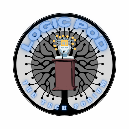
So, for the radio show promo I wanted to make the logo or a bumper sticker or something that could get the point of the show across in on quick glance. The first thing we had to do was come up with the show name, and based on our characters motivations we dialed it into a podcast format about discussing AI and tech etc. with people calling in to discuss their viewpoints or promote their ides. With all of our characters being pro AI for the most part, we assumed that they would all think their view is correct, so their podcast is “logical” to listen to. Then to describe what it is about, we went with tech, and with the call-in aspect, it is like a singular outside entity speaking to the group, almost like from a podium. At least that what was in my head when we nailed down the name.

Moving on… So, for the design I wanted to capture the title of the show and have some interesting graphics to give some energy to the show. My initial idea was to just have a brain standing behind a podium with the title. But as I was using Canva to make my graphic, I came across some really cool designs and changed it up a bit. This is the final product I came up with.

My absolute favorite part of this design is the tech tree. Just has this eerie implication that tech is going to take over nature… strange. And of course, talking about AI and the neon sign effects, I think it really captures the vibe of the show.

Anyway, I had a blast making this and I might even make a few more just for fun.

Aggressive Posters and Bumpers – Radio Show Design

This week I did some designing for Aggressive Testimonials, my group’s radio show. I designed a radio bumper and a poster. This post will mostly discuss the poster since I made another post detailing my process making the radio bumper.

I made the poster in Canva using my propaganda poster from a few weeks ago. I used the same AI generated robot, color scheme, and fonts. I generated a microphone using CrAIyon. I then removed the background using PhotoPea and changed the color scheme in Canva.

I think the design is very simple but functional. I like the consistency with the propaganda poster. Repeating the same aesthetic gives Aggressive Technologies a specific brand.